> ## Documentation Index
> Fetch the complete documentation index at: https://velt-mintlify-91561e57.mintlify.site/llms.txt
> Use this file to discover all available pages before exploring further.
# Comment Bubble Wireframes
> Wireframe components for building custom Comment Bubble interfaces with maximum flexibility.
We recommend that you familiarize yourselves with [UI Customization Concepts](/ui-customization/overview) before attempting to modify any components.
## VeltCommentBubbleWireframe
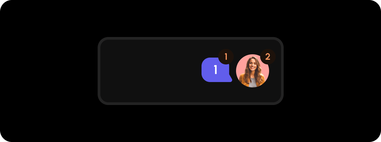 ```jsx theme={null}
```
```html theme={null}
```
## CommentsCount
```jsx theme={null}
```
```html theme={null}
```
## CommentsCount
 ```jsx theme={null}
```
```html theme={null}
```
## Avatar
```jsx theme={null}
```
```html theme={null}
```
## Avatar
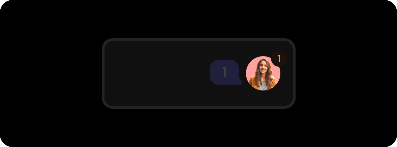 ```jsx theme={null}
```
```html theme={null}
```
## UnreadIcon
```jsx theme={null}
```
```html theme={null}
```
## Styling
### Disable ShadowDOM
* By default, ShadowDOM is used to ensure that your app's CSS does not interfere with the styling of the SDK components.
* Disable the shadow dom to apply your custom CSS to the component.
`Default: true`
```jsx theme={null}
```
```jsx theme={null}
```
### Dark Mode
By default, all components are in Light Mode, but there are several properties and methods to enable Dark Mode.
Default: `false`
**Using Props:**
```js theme={null}
```
**Using API:**
```jsx theme={null}
const commentElement = client.getCommentElement();
commentElement.enableDarkMode();
commentElement.disableDarkMode();
```
**Using Props:**
```HTML theme={null}
```
**Using API:**
```jsx theme={null}
const commentElement = Velt.getCommentElement();
commentElement.enableDarkMode();
commentElement.disableDarkMode();
```
### Open Dialog on Click
Control whether the comment dialog opens when the bubble is clicked.
Default: `true`
```jsx theme={null}
```
```html theme={null}
```
```jsx theme={null}
```
```html theme={null}
```
## UnreadIcon
```jsx theme={null}
```
```html theme={null}
```
## Styling
### Disable ShadowDOM
* By default, ShadowDOM is used to ensure that your app's CSS does not interfere with the styling of the SDK components.
* Disable the shadow dom to apply your custom CSS to the component.
`Default: true`
```jsx theme={null}
```
```jsx theme={null}
```
### Dark Mode
By default, all components are in Light Mode, but there are several properties and methods to enable Dark Mode.
Default: `false`
**Using Props:**
```js theme={null}
```
**Using API:**
```jsx theme={null}
const commentElement = client.getCommentElement();
commentElement.enableDarkMode();
commentElement.disableDarkMode();
```
**Using Props:**
```HTML theme={null}
```
**Using API:**
```jsx theme={null}
const commentElement = Velt.getCommentElement();
commentElement.enableDarkMode();
commentElement.disableDarkMode();
```
### Open Dialog on Click
Control whether the comment dialog opens when the bubble is clicked.
Default: `true`
```jsx theme={null}
```
```html theme={null}
```